


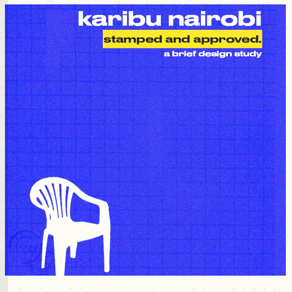
When was the last time you really looked at a postage stamp? They used to be tiny ambassadors of national identity, exporting carefully curated mythologies across borders. Nairobi-based multimedia designer Sinatra Chumo looked, and found a gap between what Kenya’s stamps project and what Kenyans actually live.
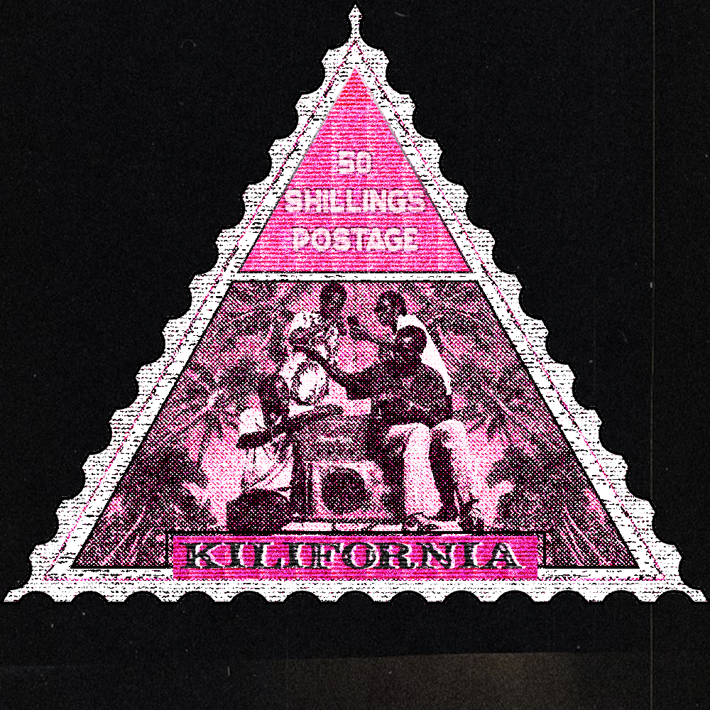
Karibu Nairobi: Stamped and Approved reimagines the postage stamp as a document of contemporary Nairobi: social inequality, political complexity, resilience and the lived experiences that official symbols typically erase. Working within the formal constraints of mid-century philatelic design (period typography, distressed textures, archival color palettes), Chumo recreates the visual language of traditional stamps while inverting their function. Instead of sanitized nation-building, these designs surface what gets left out.
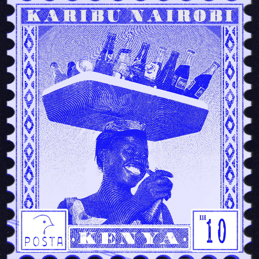
What drew you to the postage stamp as a way of reflecting contemporary Nairobi?
Stamps used to be these tiny storytellers, miniature ambassadors carrying a nation’s identity across borders. But somewhere along the way, we stopped updating the story. Kenya’s stamps still show the same narratives from the ’60s: wildlife, aspirational agriculture, proud monuments. It’s not that those things don’t exist. It’s that they’ve become a script we perform rather than a reality we inhabit.
I was drawn to the stamp because of that gap between official narrative and lived experience. It’s also a forgotten canvas. Most people don’t look at stamps anymore, which made it interesting to ask: what if we did? What if this tiny, historically loaded format could document the Nairobi we actually navigate, social complexities and all? The constraint of working within a one-inch square felt generative rather than limiting.
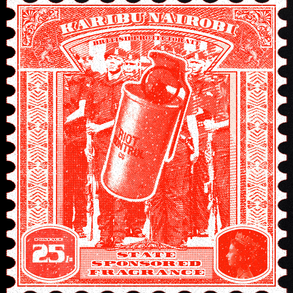
What were you most interested in revealing through this series that official national imagery often leaves out?
The contradictions. The friction between aspiration and reality. Official imagery tends to smooth everything over. It shows us at our best or what we want to project to the world. But contemporary Nairobi is more textured than that. Inequality sits next to innovation, political disillusionment coexists with daily resilience, and the informal economies that actually keep the city running rarely make it into official symbols.
I wasn’t interested in making cynical work or just pointing at problems. I wanted to document the full picture, the parts that get left out not because they’re shameful but because nation-building design has always been about curation. What happens when we stop curating and start documenting honestly?
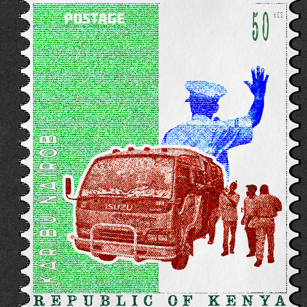
How did you approach the visual language of the work, particularly the balance between archival stamp aesthetics and present-day realities?
The visual language had to be precise. I researched Kenya’s philatelic history and studied how stamps functioned globally as tools of identity construction, particularly in postcolonial contexts. Then I recreated the aesthetic as faithfully as possible: period-appropriate typography, distressed textures to mimic aged paper, archival color palettes, and the compositional formality of traditional stamps.
The constraint was important. Staying inside the visual grammar of official stamp design rather than abandoning it makes the content shift land differently. The stamps look “right.” They feel official. That cognitive dissonance between familiar form and unfamiliar content is where the work lives. It asks: what if institutions used the same care for documentation that they reserve for myth-making?
In what ways does this project reflect your broader design practice and the kinds of stories you want your work to tell?
I’m interested in design as a site of cultural critique. Not design that just looks good or solves problems efficiently, but design that asks questions about power, representation and inherited visual languages. A lot of the forms we use to communicate, especially in postcolonial contexts, weren’t designed by us or for us. They were inherited. So the question becomes: do we reproduce them as-is, or do we reclaim them?
Karibu Nairobi reflects that approach. It’s about taking a colonial design tool and using it to tell our own truths. More broadly, I want my work to explore the gap between how places brand themselves and how they’re actually lived, between official narratives and everyday realities. Design can be a tool for honest storytelling when we let it.
Sinatra Chumo is a multimedia designer based in Nairobi. View more of his work at sinatrachumo.com.
Images courtesy of the artist. Credit: Sinatra Chumo, Karibu Nairobi: Stamped and Approved (2025/2026).